Introducing the new Lorbrand logo
The word “Lorbrand” is an amalgamation of the family names Lorenz and Brandstätter, both of which are of great importance to the Granigs who descended from these families and went on to found the company in 1985. As a name, it speaks to the rich heritage, values and spirit of innovation that continue to impact every aspect of the business.
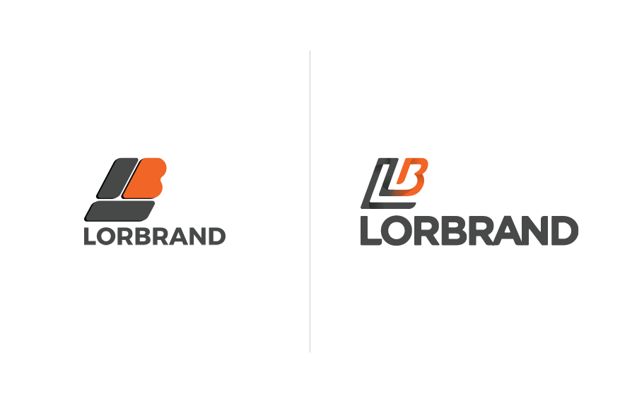
When Lorbrand was established 30 years ago, the design of the company logo was undertaken in-house. As a start-up at the time, this suited the business’s needs but as the organisation began to grow management soon realised that the original logo no longer reflected the services or brand identity Lorbrand wanted to convey to the world.
After decades as an international powerhouse in the conveyor manufacture industry, a decision was made to reimagine both the company logo and corporate identity. Today, Lorbrand is proud to reveal the newest versions of both.
Retaining the well-recognised Lorbrand orange and grey, the new logo has been modernised by paring back the iconic “LB” symbol and transforming it into a more figurative and rounded emblem that communicates the movement of a conveyor. The Lorbrand company font has also been simplified to make it feel more contemporary.
Lorbrand management is thrilled with this iteration of the company logo and the rollout of the accompanying brand identity. Both are distinctly familiar—maintaining our original founding vision and heritage—whilst communicating the company’s constant professionalism and innovation for the future.


